A good website is one that functions for the purpose, appeals to its audience and has content that delivers. All this assumes it has easy usability for the visitor and good self management for the owner.
But how should you consider the graphic look of your website?
Graphic design, or the look and feel of a website, has been shown in website usability testing to be a primary factor in whether visitors like and trust a website. That's a critical factor in success.
I believe this is because there is so much surfing choice online that we've become impatient to find something that appeals. It means we make rapid and often what seems to be superficial choices. That's where the appeal of good graphic design kicks in – it creates instant appeal but it also helps sustain attraction.
But let's not think we need to appeal to everyone. We only need to design a website that appeals to the target audience. If you get that right, you're onto a winner with your audience, and it doesn't much matter if others don't like it much.
Design for a reason
Ever heard the expression, "form follows function"? It's a term used in design circles to place functionality at the forefront of design decision making.
Your website should be valuable to you. It's possible that it's not because of dodgy functionality, which will mean that it doesn't matter much how pretty you make it, it just doesn't seem to work very well. A common reason for that is that too many clients brief their websites to developers based on their own personal tastes, rather than properly considering what will appeal to an audience.
Let's just consider for a moment the typical functionality of a website homepage. On most homepages, five key factors should be present immediately and obviously, or in some combination:
- Searchability – ability for the visitor to discover a solution.
- Promotability – the site manager's ability to promote an important or current piece of information.
- Currency and flexibility – the site regularly delivering up-to-date and fresh content.
- Content promise – the site immediately communicating that it has useful content.
- Structure and emphasis – the site helping the visitor to logically find accessible content, making sure that the most important things are obvious.
Whilst not all websites must have all five, it's nevertheless an interesting way to assess the functionality of a website and to consider how your website workings should be displayed.
Type of website dictates the design
Online impatience also drives us to make instant decisions about the appropriateness of a website to "my needs". This had led to what I think of as "website genre". It's most noticeable in website categories such as for newspapers, real estate and dating sites. There has emerged a certain style for each which tells the visitor that they're in the right place.
Website genre and types
A website for a women's beauty parlor shouldn't be designed as if it were for a boxing gym.
I've categorised a few FRESCO built websites below to demonstrate that website genre and appropriate functionality should go hand-in-glove. Each one of the following not only has a type of visual flavor, it also presents its functionality differently, often subtly.
Classic news content
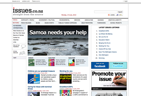
Websites from the Times of London to the Boston Globe mirrored their origins on printed pages. Now they influence the design of websites for news, current affairs and many blog sites.
Classic news content example: Issues.co.nz
Minimalist style
Google exemplifies this website genre with its single search box and little else. These websites don't need much more than a search function but it's interesting how they frequently evolve to become decorated and sometimes cluttered as time goes by.
Minimalist style example: AtticStars.co.nz
People style
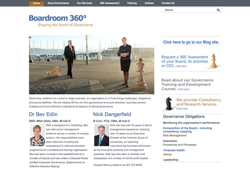
Websites presenting people in business, experts, opinion makers, etc, often need to visually present the people in an obvious way. The style of the website, as always, needs to mirror the purpose and content.
People style example: Boadroom360.com
Storyteller
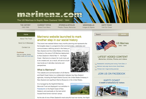
The rich experience of the story book, where the written word is embellished with illustrations, carries neatly through to the website page. Many children's websites as well as sites about history, education and instruction, use this genre.
Storyteller example: Marinez.com
Small business
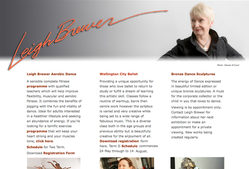
A small business is not a corporation with high rise offices and thousands of people, so the website shouldn't pretend to be something it's not. Often a small business has only one or two people working so it might contain some personal elements, and the homepage might need to work without much regular attention.
Small business example: Dance Sculpture

Related items
BLOG POST: A shopping website should be just that... a shop
BLOG POST: Online fundraising and offline work together as one
BLOG POST: More website traffic – the dummies guide
BLOG POST: Brand development for online start-ups needs purpose and discipline


